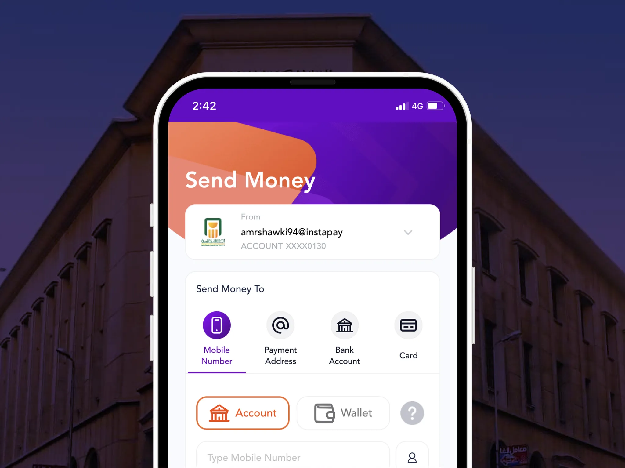
Telda: send, spend & save money
Telda set out to build the simplest way to send, spend, and save money for a generation that expects great digital experiences. This is a UX audit of what they got right, what could be better, and what every FinTech product can learn from it.

👋 Welcome, glad you're here. Leave your email below and I'll keep you posted about new case studies👇
This article is the first in a series of articles in which I will conduct a UX audit for the most popular startups in the Egyptian market initially and soon in the MENA region.
Less than 2 years ago, Telda was founded with a mission to build the simplest way to send, spend & save money for Millennials and Gen Z, along with the big change that's happening in the financial regulations by the Egyptian Central Bank.
Bringing a better way to send, spend and save money doesn't only mean offering a more technically advanced approach but also a better user experience in terms of landing, onboarding, transacting, and tracking.
In this case study, I will share with you my insights on what we can learn from Telda's user experience, what could be improved, and how we can answer the question of how we can build a better solution to send, spend and save money.
Case study
The case study is divided into 2 parts:
1- UX Audit
2- A deeper dive into the UX
The psychology of waiting in line
I still remember the scene of people waiting in a long line for a long time for the first Baskin-Robbins branch in Egypt. A lot of digital apps these days use the same trick to acquire thousands of users before the company/product even existed.
Here is a screenshot from my Notion account waiting for Notion AI and a number of users more than the population of Estonia ahead of me.
 ## FOMO
FOMO is the feeling of apprehension that one is either not in the know or missing out on information, events, experiences, or life decisions that could make one's life better. Companies leverage psychological phenomena like FOMO to make potential customers feel like they might be missing out on something that can often move them to action. FOMO works pretty well, especially for Millennials and Generation Z, which is in line with Telda's target segment, since FOMO was first observed on social networking sites.
 Telda's product team did a few things to take advantage of the theory and present it right:
- First, they gently informed their visitors about limited availability, and they explained the reason for that.
- Second, they clearly displayed the user's current position.
- Third, they encouraged users to invite their friends to move up in the line with a clear CTA button.
One thing that could have been done better is communicating the reward in a clearer way by doing 2 things:
- The reward should be visually clearer (8,900 steps).
- Easier to digest. The 8,900 number doesn't mean anything until you divide 89,301 by it to find out that you need to make 10 invitations to get your card. 10 invitations is a way easier number to digest and an encouraging number to take action based on. However, when I dug deeper into the experience, I found that actually, this was an arbitrary number and your position might differ based on many other factors like the operation team's capacity to activate new users, and maybe that's why they didn't emphasize the reward.
I bet that one of the biggest challenges facing Telda's team now is that they have a very large number of accounts that have been registered and are ready to receive the card, but they did not take the next step. The reason behind my bet is that the time between the last friction point (registration) and receiving the card is so long, and it might last for months for a lot of users. I wonder how they tackle this issue now. How do they re-engage the users who may have lost interest?
The UX of file upload
Creating a bank account has always been a laborious task — and might've taken a whole afternoon — but can now be done in seconds, from the comfort of your own home, and this is exactly what FinTech companies have brought distinctively to the industry.
Your marketing fellows did a hard job trying to convince new users to download the app and start creating an account. You don't want to lose users at an early stage of your funnel, especially in FinTech apps where it usually requires a lot of information and documents to sign up a user.
 Here are some tips for the best file upload experience:
1- Provide clear instructions for uploading the document right up front. Instructions might include photo capturing instructions, file type, size restrictions, or the number of pages that need to be uploaded.
2- Indicate that uploading/capturing is in progress and provide a progress bar, especially for large files.
3- Make it easy to remove/retake new documents.
4- Handle errors gently by providing clear messages to help users resolve their issues quickly.
5- Give users a chance to view and confirm their inputs.
6- In case you design for a desktop browser, consider these 2 additional tips:
1- It doesn't make sense to ask users to capture a photo from their laptop as it takes a lot of pain to capture the photo from their phones and then send the photo to their laptops to upload. So how can we tackle this? Simply by giving users the chance to continue the process from their phones. To make this right, you should do 2 things:
- First, let users know that they can do that. Don't just assume that they're going to figure it out by themselves (don't make me think).
- Second, provide a QR code so that they can scan it and navigate directly to the required page.
2- Allow users to drag and drop files to make the experience faster as it requires fewer steps.
The zero-cost trial
The pre-activation step is somehow part of the onboarding process. You want to help users find the value in your product so that you decrease the friction when the time to really use the app comes. Not sure if Telda did it on purpose, but letting users try Telda before activation and go through the entire process with zero risk is a smart move, especially since Millennials and Generation Z love to move around and try new things.
UX Lessons Summary
- Show your company's value proposition early — the onboarding screens are the best place to do so.
- Make sure to provide your users with enough explanation and tips for any step that requires users to do extra effort like document uploading, to avoid high drop-off rates and pressure on your customer support.
- Always consider using clear wording in the last step of any flow like registration, placing a transaction, or doing a purchase. Wording like "create account" is better than "continue or confirm", and "confirm sending $5" is always better than "send".
- UX design is not just about designing digital apps, but about every point of interaction between the service and the user.
- Psychology phenomena must be used with caution.
Enjoyed this?
I'll email you when there's a new deep-dive worth your time — nothing else.