UX Bites

Design details worth stealing

Screenshots from popular apps, with the design lesson and the psychology behind each one.

Wispr FlowUX Bite from Wispr Flowยท Jul 5, 2026

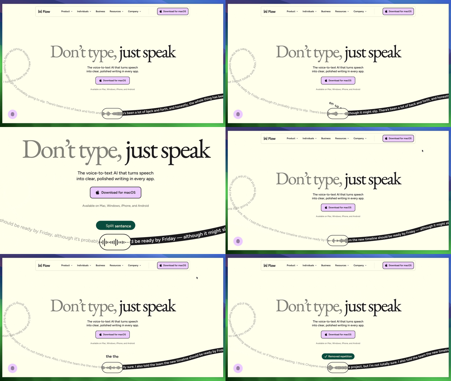
Wisperflow's one curvy line explains the entire product

The homepage shows one line of text. It starts as messy handwriting, then turns into a clean black bar with a waveform and clear text.
Wisperflow's one curvy line explains the entire product
The psychology behind it
What you can learn

This shows the whole point of the product without using any words in the hero section. The animation isn't decoration, it's the demo If your product turns one thing into a better thing, show that change directly instead of describing it.

Landing page
StripeUX Bite from Stripeยท Jul 8, 2026

Skip the product list, just describe your business

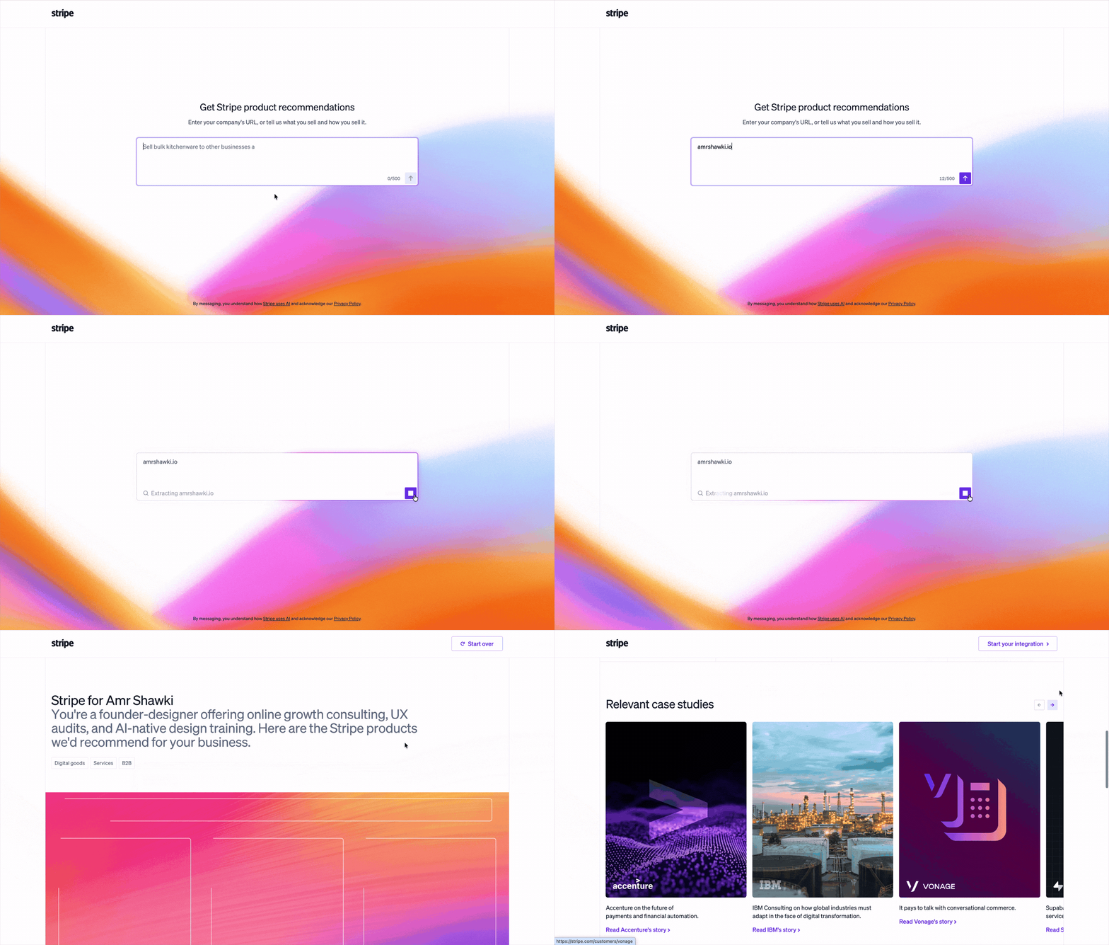
Instead of listing every product, the page asks you to paste your company's website or describe your business, then uses AI to research it and recommend the specific Stripe products that fit.

Skip the product list, just describe your business
The psychology behind it
What you can learn

Stripe has more than a dozen products, Payments, Billing, Connect, Radar, Tax, and more. Most companies handle that by handing you a comparison table and letting you guess which ones apply. This page skips the guesswork with one plain question: tell us about your business. The matching work moves from you to their AI, so instead of a stack of tabs to compare yourself, you get one confident, specific answer.

Onboarding
FigmaUX Bite from Figmaยท Jul 8, 2026

The AI suggestion that's secretly an ad

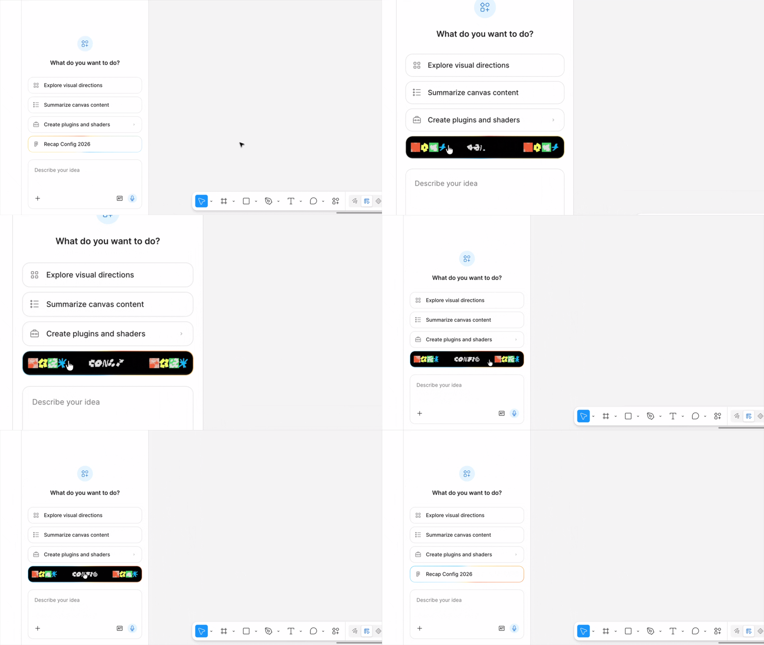
Of four AI suggestion buttons, three have plain gray borders. The fourth, "Recap Config 2026," has a moving gradient background, and on interaction it reveals a scrolling black bar with repeating "CONFIG" text and icons.

The AI suggestion that's secretly an ad
The psychology behind it
What you can learn

Three of these four options are real suggestions for what the AI can do. The fourth is a promo for Figma's own conference, wearing the exact same suggestion-chip shape as the others. The moving border and hover animation don't help you work faster, their only job is to make your eye land there first. It's a clean way to run an ad inside a surface that normally has none: copy the format everyone already trusts, then spend all the visual effort on the one entry that's actually a pitch.

Core usage
ChatGPTUX Bite from ChatGPTยท Jul 7, 2026

How Codex makes switching tools feel safe

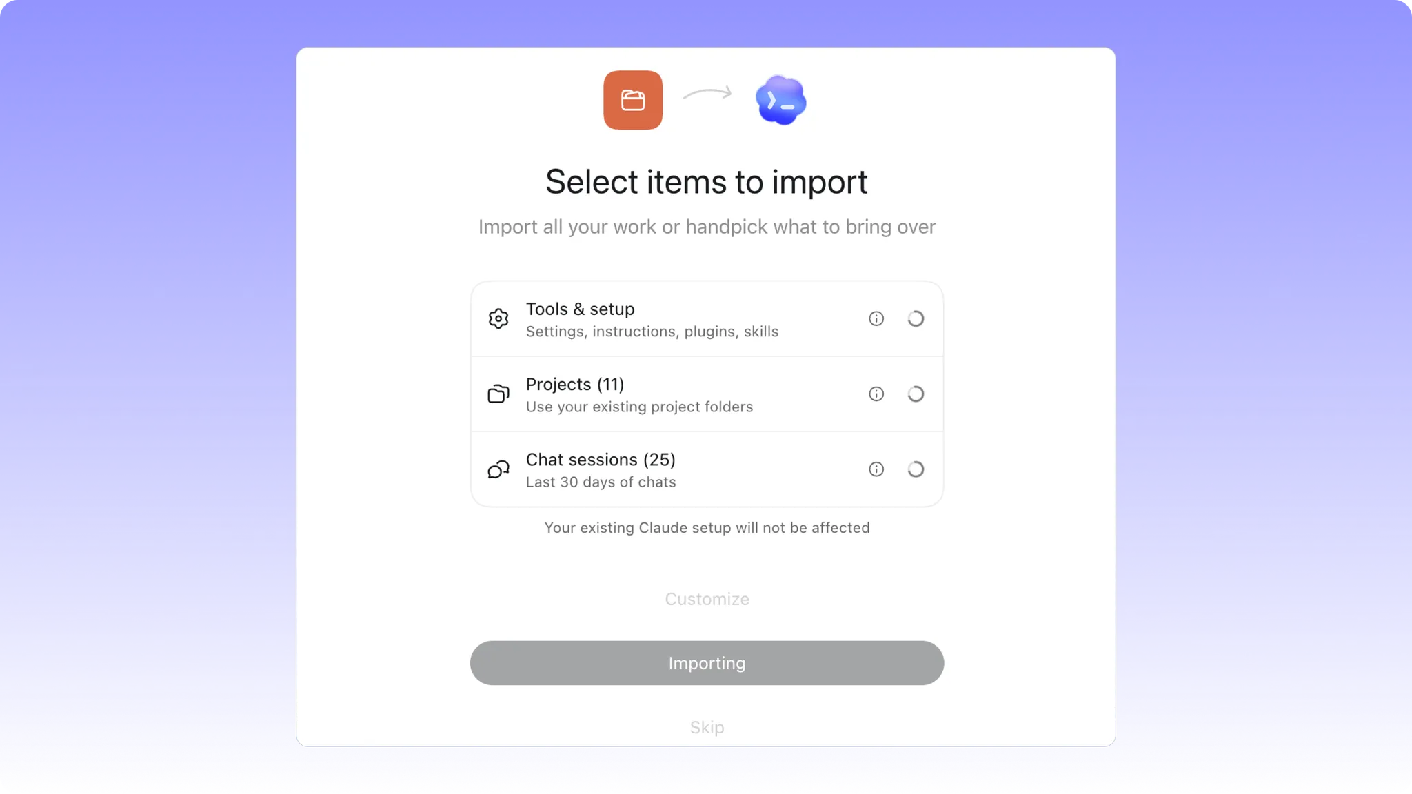
A migration screen lets you selectively import Tools & setup, Projects, and Chat sessions from Claude, with each item's scope shown (e.g. "25 chats, last 30 days") and a note confirming your existing Claude setup won't be affected.

How Codex  makes switching tools feel safe
The psychology behind it
What you can learn

This screen makes migration much easier and smoother, retaining your context and projects, the most important thing for AI tools. Lowering the effort to switch is one of the highest-leverage moves a competitor product can make.

Onboarding
StripeUX Bite from Stripeยท Jul 8, 2026

Global GDP running on Stripe

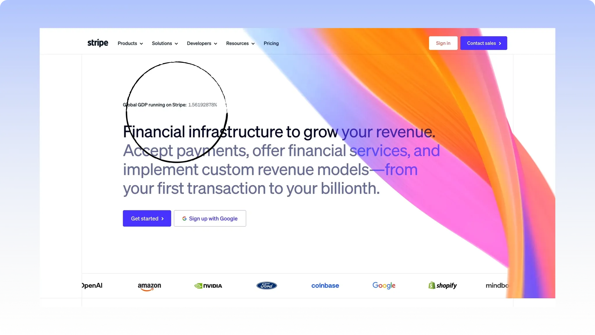
Above the headline, small text reads "Global GDP running on Stripe: 1.56192878%", a percentage carried out to eight decimal places.

Global GDP running on Stripe
The psychology behind it
What you can learn

A round number like "1.5%" reads like a marketing claim, something a designer could have just picked because it sounded good. Eight decimal places reads like something pulled straight from a live database. Nobody bothers faking that much detail for no reason, so the precision itself becomes the proof. The exact number barely matters, what matters is that it looks real, not rounded up to impress you.

Landing page
Wispr FlowUX Bite from Wispr Flowยท Jul 7, 2026

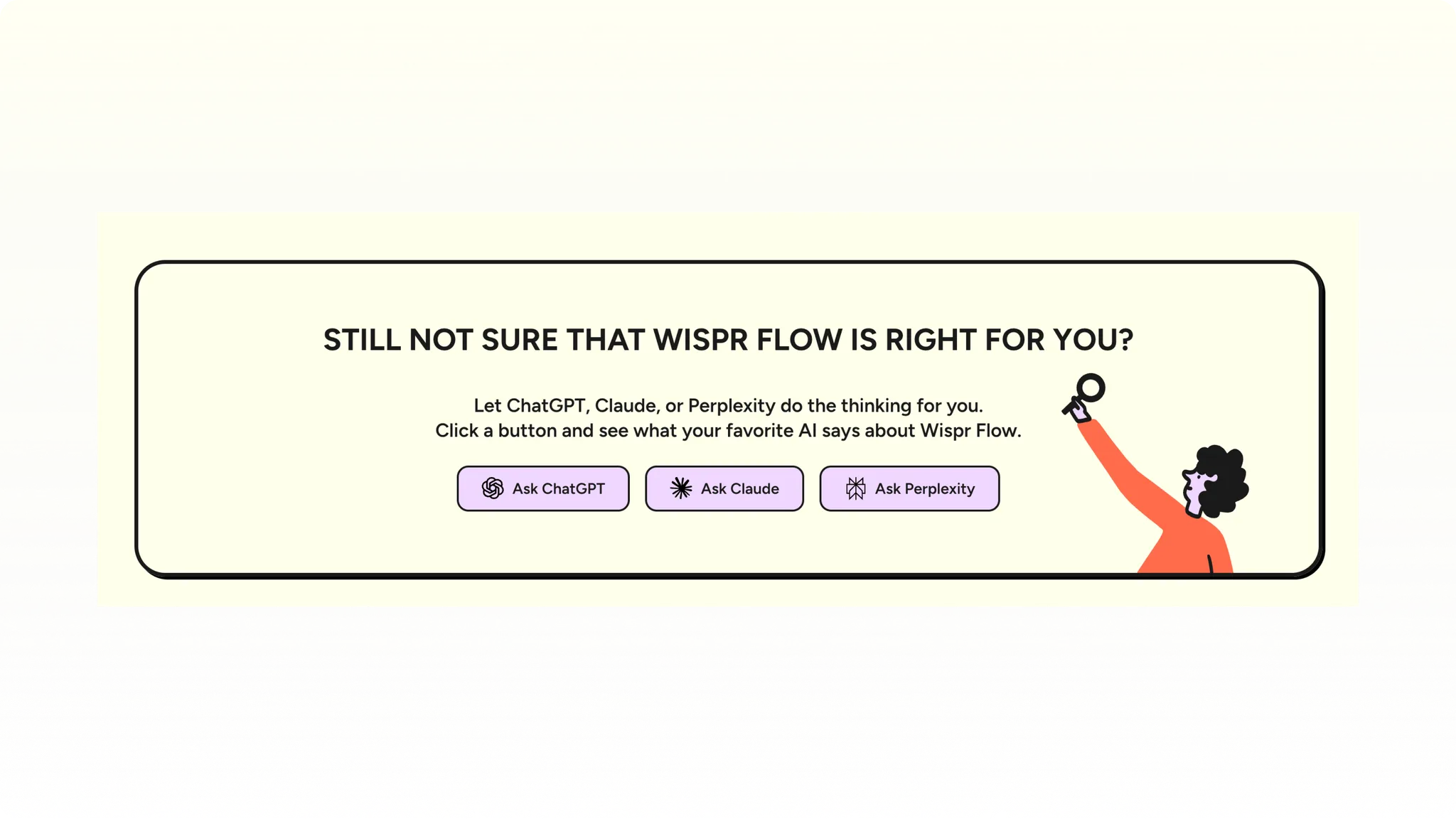
Ask ChatGPT if we're worth it

A landing page section titled "Still not sure that Wispr Flow is right for you?" offers three buttons, Ask ChatGPT, Ask Claude, Ask Perplexity, that send a hesitant visitor to get a third-party AI's opinion on the product.

Ask ChatGPT if we're worth it
The psychology behind it
What you can learn

People already ask ChatGPT "is this product actually good" before buying, most companies just don't control for it, and hope the AI says something nice. It's also a confidence sign, a company nervous about what an AI might say about them would never make it a homepage CTA because they are confident

Landing page
DunkinUX Bite from Dunkinยท Jul 8, 2026

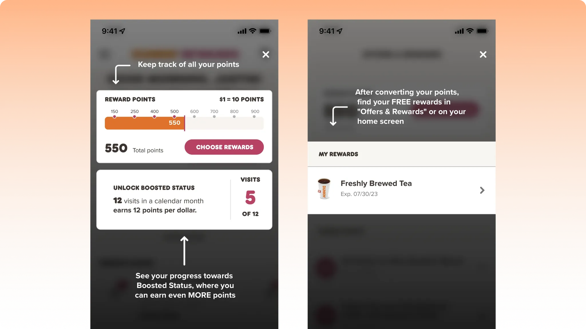
Two reasons to come back today

A tutorial overlay points to two things at once: a reward points bar at 550 out of 900, and a separate counter showing 5 of 12 visits toward "Boosted Status."

Two reasons to come back today
The psychology behind it
What you can learn

This screen runs two goals at the same time, not one. The points bar gives you a reason to spend more today. The visits counter gives you a completely different reason to just show up again soon. Most apps pick one loyalty mechanic and lean on it, stacking two means there's almost always a number on screen that feels close to done, whichever reason actually gets you back in the door.

Onboarding
AlanUX Bite from Alanยท Jul 8, 2026

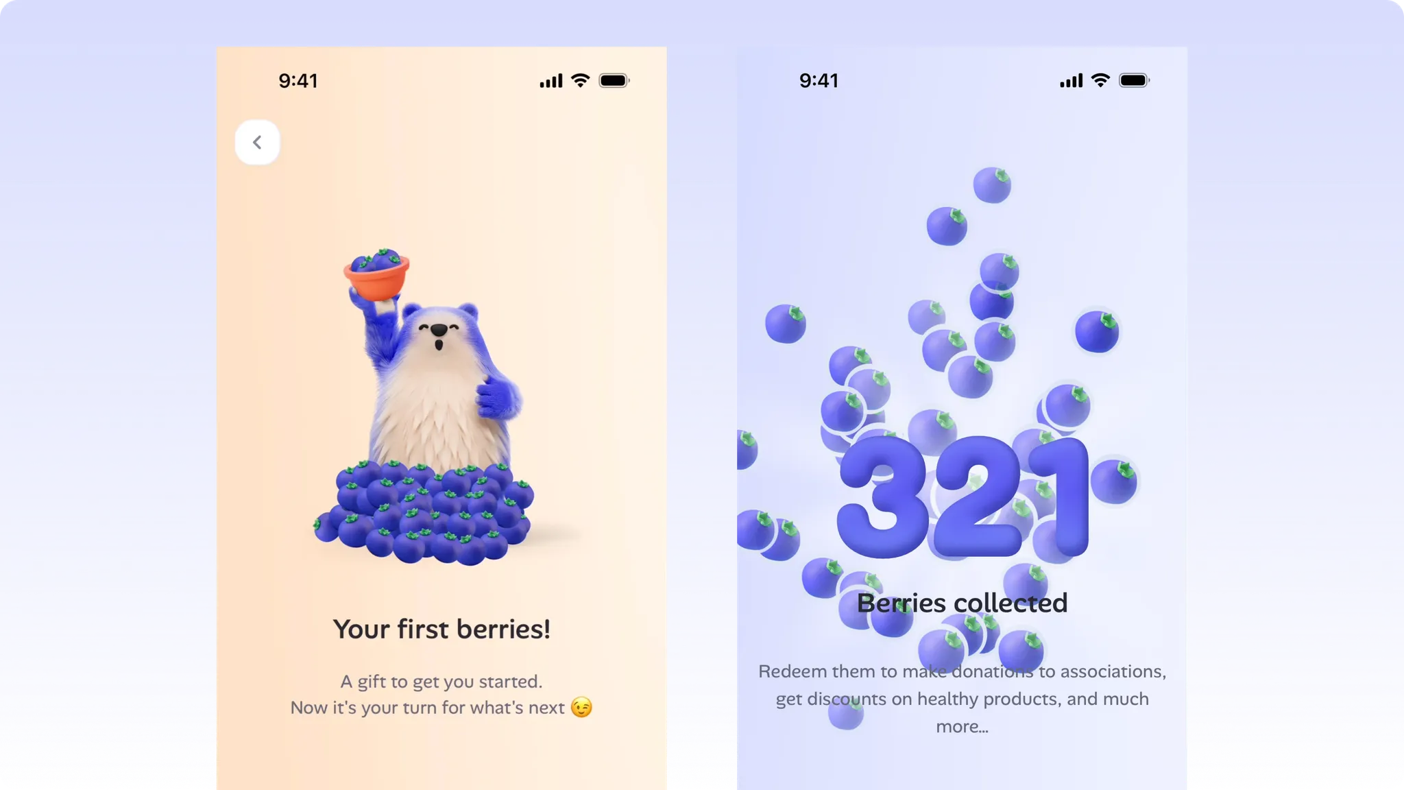
Free berries before you've done a thing

A first-time screen shows the app's bear mascot holding a pot of berries next to the text "Your first berries! A gift to get you started. Now it's your turn for what's next," with a "Collect my berries" button.

Free berries before you've done a thing
The psychology behind it
What you can learn

They hand you the in-app currency before you've done anything to earn it. The copy makes the exchange almost explicit โ€” it calls it a "gift," then immediately says "now it's your turn." You got something first, so giving something back next (an action, some attention, staying in the app) feels natural instead of forced.

Onboarding
AirbnbUX Bite from Airbnbยท Jul 8, 2026

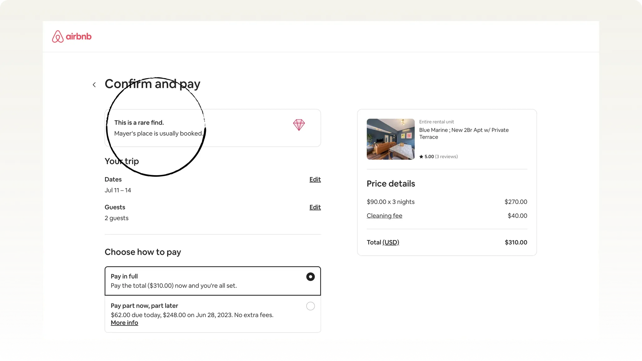
How Airbnb uses scarcity effect to push you to book now

Right above the price, on the payment screen, a box says "This is a rare find. Mayer's place is usually booked." next to a small diamond icon.

How Airbnb uses scarcity effect to push you to book now
The psychology behind it
What you can learn

This message shows up at the exact moment you might stop and think twice, right before you pay. It does two things at once:

  • it tells you this place is rare
  • It tells you other people usually book it first.

Both point to the same feeling: don't wait, or you'll lose it. Most sites show trust signals like this early, on the listing page. Airbnb puts it at the very last step, where doubt is highest and it matters most.

Checkout & Payments
FigmaUX Bite from Figmaยท Jul 7, 2026

The most boring click on the page got the most polish

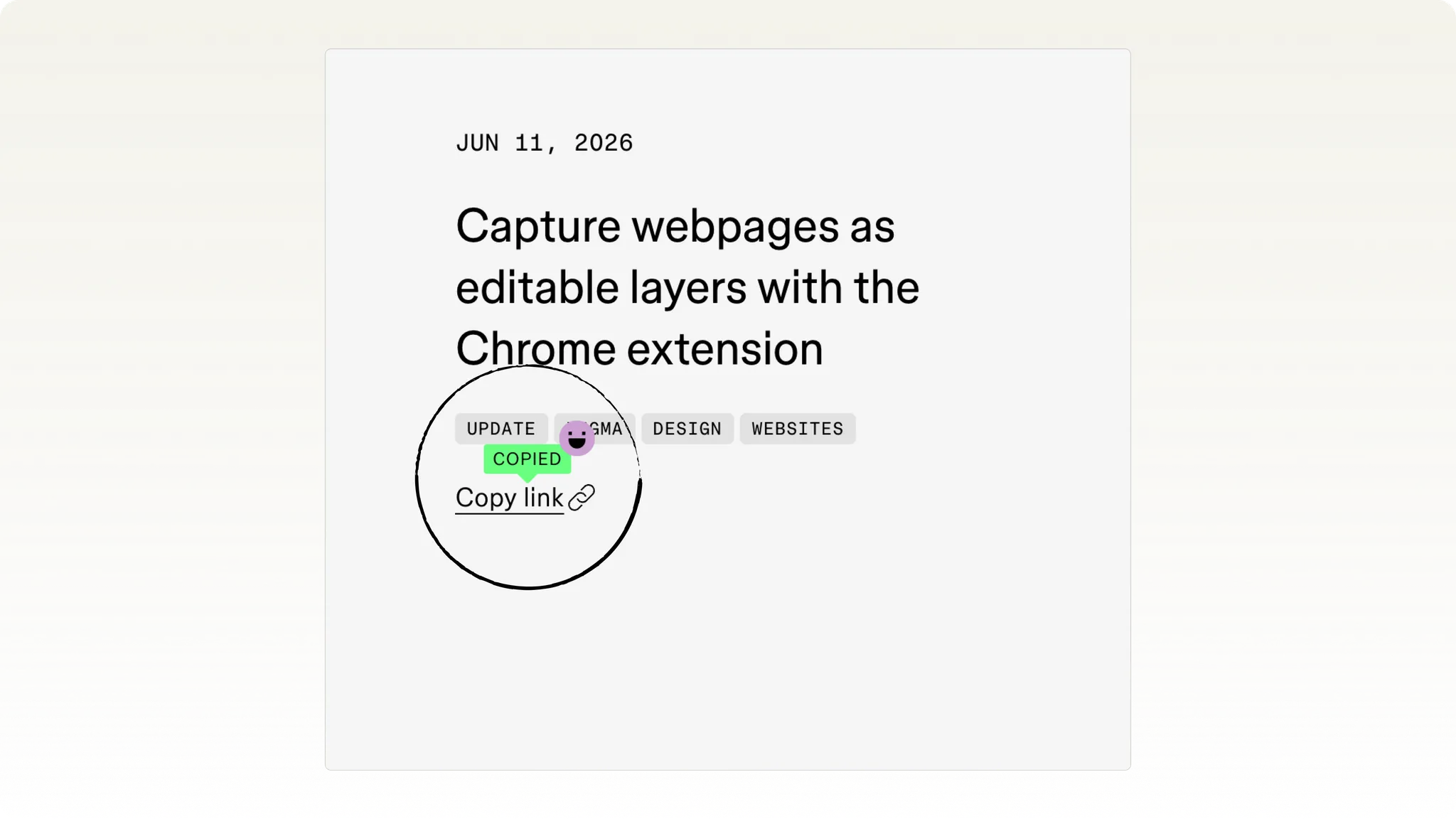
Clicking "Copy link" on a Figma changelog post triggers a green "COPIED" confirmation toast alongside a small character/emoji next to the link icon.

The most boring click on the page got the most polish
The psychology behind it
What you can learn

Every product has a "copy link" button, and almost none of them bother with more than a gray tooltip that fades in half a second. Figma spent craft on this โ€” and that's exactly why they are unique. The ROI on delight is highest precisely where users expect zero effort from you, because it's a surprise instead of an expectation.

Referral & Sharing