InstaPay UX Audit: From Good to Great
InstaPay launched to serve 36.8 million Egyptians with instant, digital payments. The technology works. But a great product deserves a great experience, and there's still a gap between the two.

👋 Welcome — glad you're here. Leave your email below and I'll keep you posted about new case studies👇
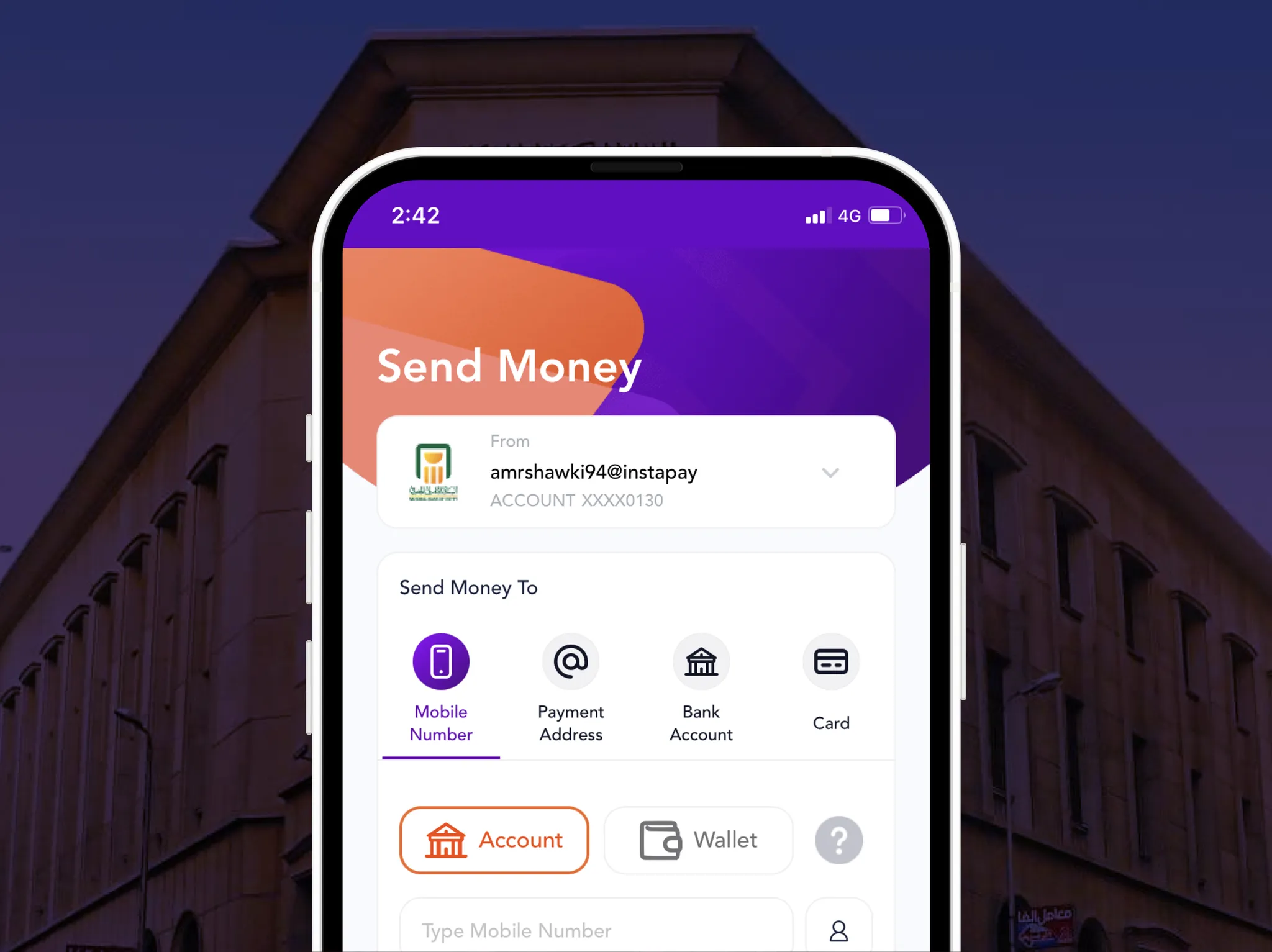
Almost one year ago, the Central Bank of Egypt announced the official launch of the national system for the instant payments network and the InstaPay mobile app, targeting more than 36.8 million banked citizens. Since then, the mobile app has been showing rapid growth with +1M downloads and hundreds of thousands of active users. The CBE's goal in launching the app is to transform society towards less dependency on banknotes and enable convenient, secure, and affordable digital financial transactions for all Egyptians.
Before going deeply into the slideshow, I want you to consider the following factors while reading the case study:
- The big vision of achieving financial inclusion and digitalization
- The huge number of potential users (36.8 million users and growing)
- The diversity of the user types in terms of age, technical experience, etc.
These factors and more put big ambitions on the user experience and raise the expectations bar.
Case study
Good To Great Design
Good is the enemy of great, in companies as well as designs. If you aim for a good design, then there is no way to a great design. It's just so easy to settle for a good design. Great designs never happen by accident. So what makes a great design? I believe there is no easy answer to that. It's a combination of a few things. Let's look at the "bank selection screen" in the InstaPay app and try to make it a great design.
 InstaPay, Good to Great Design Process
 Why this is a great design?Great designs consider the following:
- The business: InstaPay design should consider the Central Bank's vision of applying an open banking system and including all banks.
- The Product: One of the key KPIs of a product in such a stage is user acquisition. The design should strive to acquire as many users as possible and leave all doors open for users to come back.
- The user: Users need to be informed about the current system status and whether there is a chance to tackle the issue or not.
UI designers' biggest vanity metric
The word vanity metric in the product world means a metric that makes you look good to others but doesn't help you understand your own performance in a way that informs future strategies. Similarly, UI designers make a lot of effort to show off their graphic design capabilities without focusing on the most important value of the UI design. The ability to show off your graphic design skills is your biggest vanity metric as a UI designer. Going around putting a lot of colors and illustrations in a place or context that doesn't really require that does more harm than good.
Let's take the transaction confirmation screen for example.
 Instapay transaction confirmation screenThis screen contains 11 different colors (besides the bank logo), derailing users' attention and destroying the visual hierarchy.
“If everything yells for your viewer's attention, nothing is heard.”
*> Aaron Walter, “Design for emotion”.
Better onboarding experience
Building Trust > Collecting Data:
Data is super valuable. It's the new oil and the most sold thing around the world every day. The direct benefit of a user giving data is for the company. So what's in it for the user?
1. Give value before asking for value
InstaPay should have delayed the important data request to a later stage. The best stage to ask for contact access — in InstaPay's case — is right after the user adds their bank account. This is the step where users get the first benefit dose.
 Delay asking for the important data2. Give enough context
In case you are wondering why I keep emphasizing the data collection concern, here is the data you and I gave to InstaPay when we registered:
Phone number, Name, Birthdate, Email, Gender, Access to your contact list, Your bank name, Your card numbe and ATM Pin code.
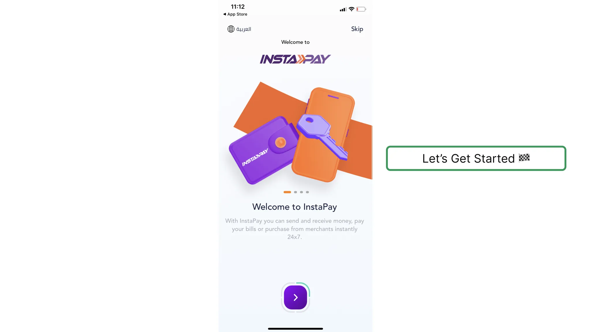
InstaPay's design assumes that their users should have ultimate trust in the app without giving any sufficient information about why you should trust them, why they need the data, and what they are going to use it for. Nothing on the carousel or on the registration process explains that. I believe the Central Bank's logo alone would have made a good difference.
Focus on Pains > Focus on gains
Your new users have a specific goal in mind when they first open your app — a specific job needs to be done. The first thing that might come to your mind is sending and receiving money. But this is not actually accurate. The job that needs to be done here is sending and receiving money instantly to save time and the hassles of the traditional methods with larger transaction limits.
Most onboarding experiences focus on listing the product features and benefits. I would rather focus on avoiding fear and pain instead (e.g., time-wasting). There is no way to understand users' pains other than user research. Maybe the main reason for that is what's called Loss Aversion in behavioral economics.
Use Wizard Design Pattern
The Wizard design pattern is simply splitting up a complex task into a sequence of chunks, so you can effectively simplify the task.
InstaPay could have used the Wizard Design Pattern to simplify the process of registration by splitting up the required fields into multiple screens.
Benefits of Wizard Design Pattern
- Reduce cognitive load: by focusing on one piece of information at a time instead of distracting the user's attention with a lot of information on each screen.
- Increase efficiency of use and reduce the error rate.
- More data to be stored: If you ask the user for their phone number, email, and name in the first two steps of the registration process and the user then drops out, you can use this data to reach out later for user research or send advertising/newsletter emails — or even give the user the chance to continue the process later. On the other hand, if you put all required data on one page and the user decides not to complete the process, you lose all that data.
However, Wizard Design Pattern isn’t always the most suitable choice for every design.
Glossary
Check out the Product Design Glossary to know more about these terms
Design Concepts
Visual Hierarchy, App Navigation, Wizard design pattern.
Psychology
Loss aversion.
Product & Growth
KPIs, User Acquisition, Vanity metrics, Aha Moment, Jobs to be done, value proposition.
UX Lessons Summary
- Present your business value proposition clearly on the onboarding screens and take enough time to define the user’s jobs to be done.
- First impressions last. The onboarding experience is what defines your user’s first impression of the product.
- Use the Wizard design pattern to deliver a smoother experience.
- Always, make sure to handle the other experience cases and don’t limit yourself to the basic flow.
- Good UX writing saves your user’s mental effort and your company’s money.
- Show password requirements beforehand.
- Always, consider the context of use while designing.
- Add commas to numbers consisting of 3+ digits to divide into chunks for better design accessibility.
- Using a lot of colors with no real need derails the user’s attention and does more harm than good.
Thanks for reading to the end. In case you’ve enjoyed reading this case study. Check my other case study, a UX Audit on Telda App. If you want to talk about product design, hit me up on Linkedin
References
Enjoyed this?
I'll email you when there's a new deep-dive worth your time — nothing else.