Redesigning CLX Configurator and applying immersive design concept
I led the end-to-end redesign of CLX's Custom PC Configurator, the most sophisticated part of the product, making a flow with dozens of dependent decisions feel effortless on desktop and mobile.

Context
The CLX Configurator is the most differentiated (and most complex) part of the product. It's where shoppers build a custom gaming PC from scratch: chassis, processor, GPU, memory, and many more components, each with compatibility implications.
After the experimentation phase validated that CLX customers responded to clearer, more guided interactions, the team decided to revamp the entire product. I led the design of the new configurator end-to-end. The beta is now live at beta.clxgaming.com and we're iterating on it.
The brief was simple to state and hard to do: make the most sophisticated part of the product feel effortless, on desktop and mobile.
Approach
The redesign was built on three layers of evidence:
- I watched 50+ session recordings to spot where real users hesitated, backtracked, or dropped off.
- I ran a competitive review against other PC builders and pulled inspiration from adjacent industries like gaming since we already know the bigest segment of our users are gamers and also high-end car configurators like Lamborghini's, to see which interaction models we could borrow.
I followed a well know design pattern in gaming industry called Immersive Design
 Immersive design in gaming
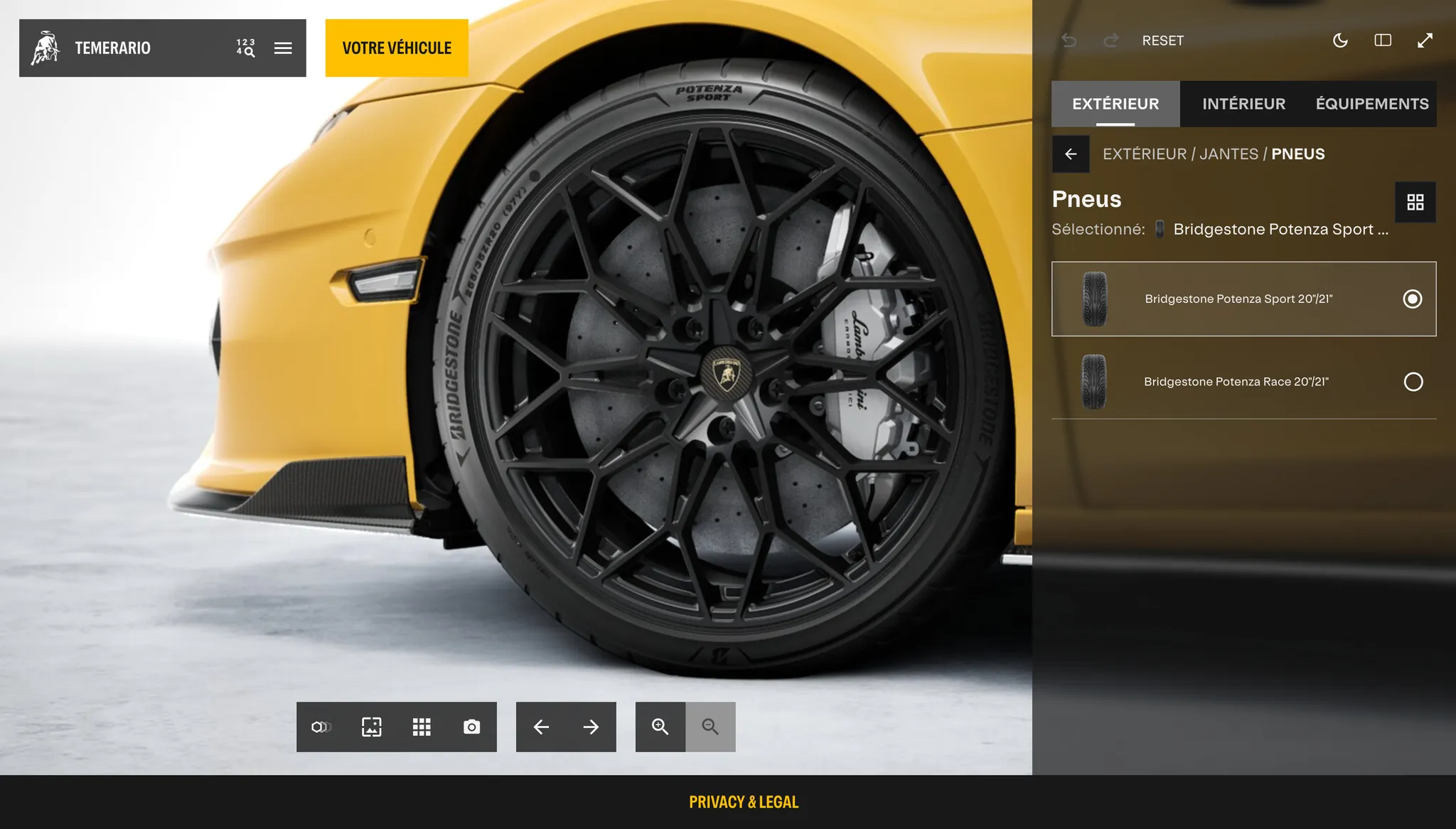 Lamborghini car configurator- I also, led an in-depth audit with the CLX team, several of whom are customers themselves, bringing a perspective no dashboard could.
How I tackled the main problems of the configurator
The page showed everything at once with no clear hierarchy, and every component category was just an icon with no labels, so users had to hunt through tabs. The PC image, the most influential visual for conversion, was too small.
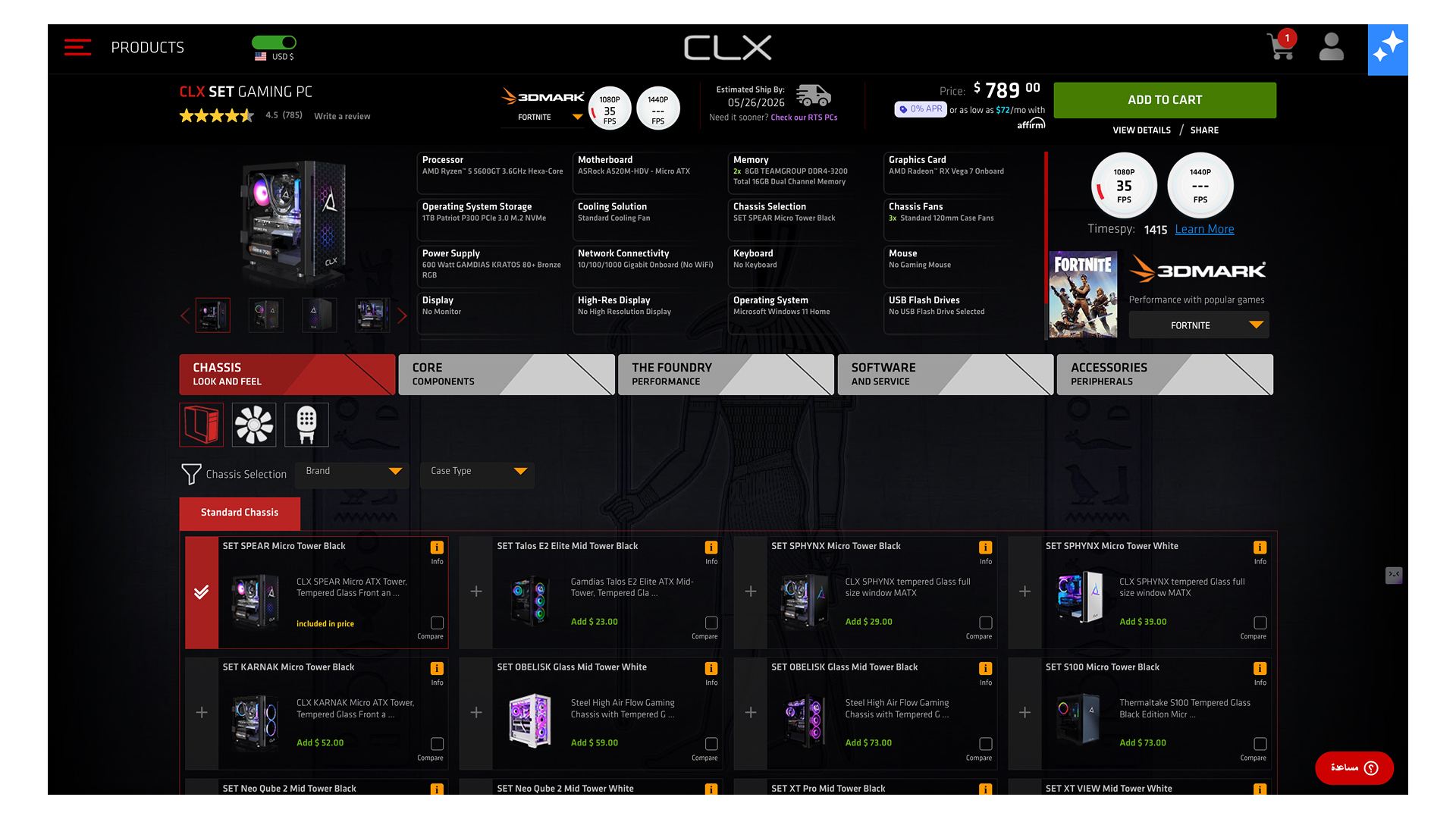
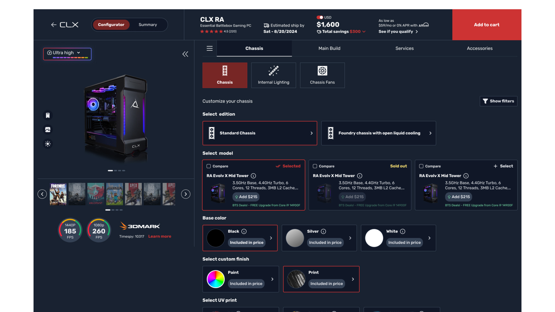
Impact
Since launching the beta platform, we've seen improvement across all metrics:
- +43.2% average session duration
- +21% average order value
- +61.7% average pages per session
- +36.8% conversion rate
Takeaway
Two learnings stuck with me. First, when a flow has dozens of dependent decisions, splitting the screen into a persistent "what you're building" zone and a "how you build it" zone removes more friction than any individual UX fix. Second, side drawers with action-first copy beat modals with descriptive copy every time — the user keeps their context, and you tell them what to do instead of what's wrong.